The Modus themes now cover deuteranopia in diffs
I just extended the modus-themes-diffs customisation option with the
ability to read a deuteranopia value.
Deuteranopia describes insensitivity to the green channel of light. This includes the possibility of not distinguishing between red and green; the two colours that are typically codified in diff buffers as denoting “removed” and “added” states respectively.
Evaluating (setq modus-themes-diffs 'deuteranopia) and then re-loading
the theme of choice will replace all instances of green in diff buffers
with variants of blue. This affects the standard diff-mode, Ediff,
Smerge, Magit, Vdiff, and any other library that inherits from those.
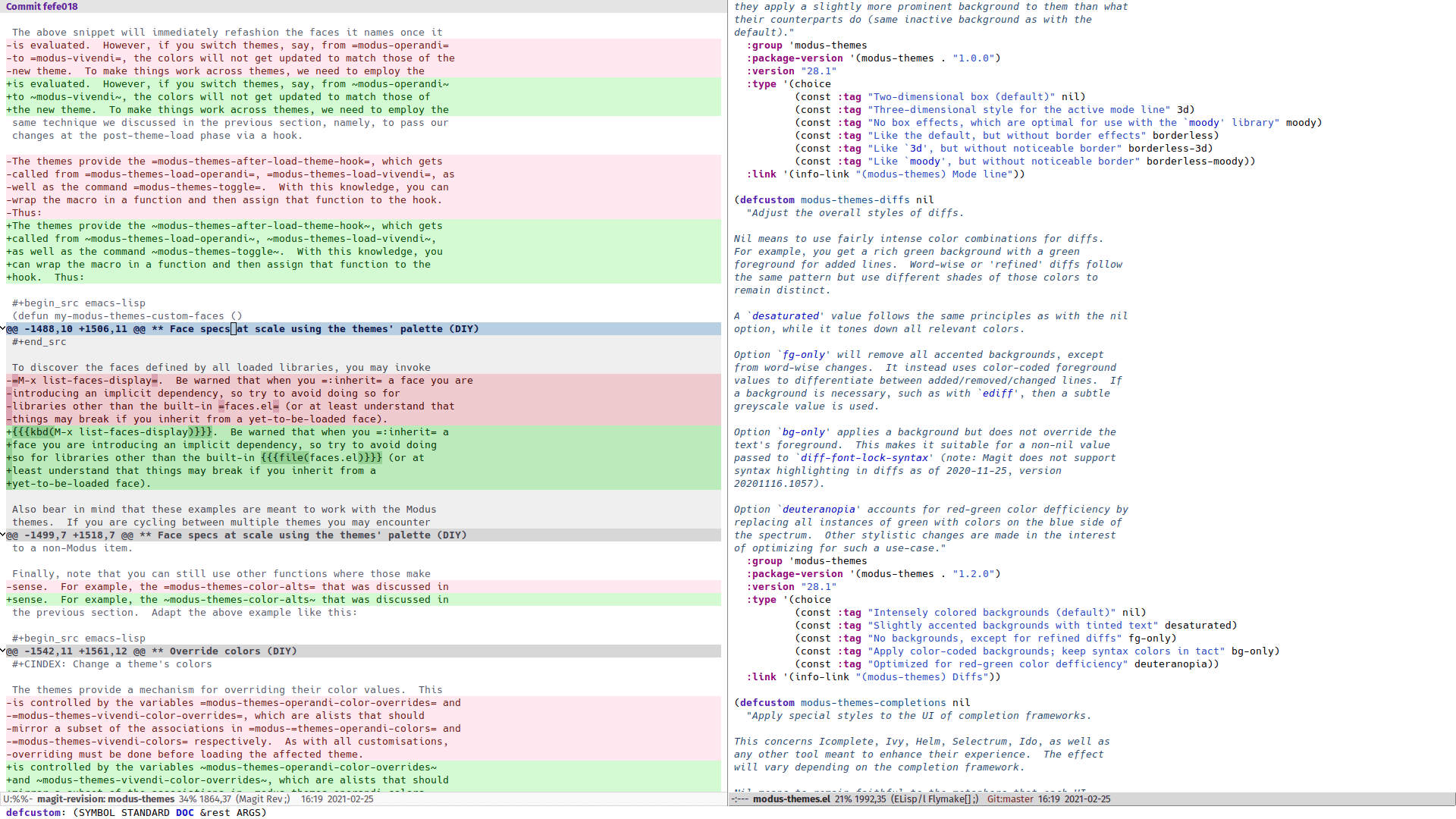
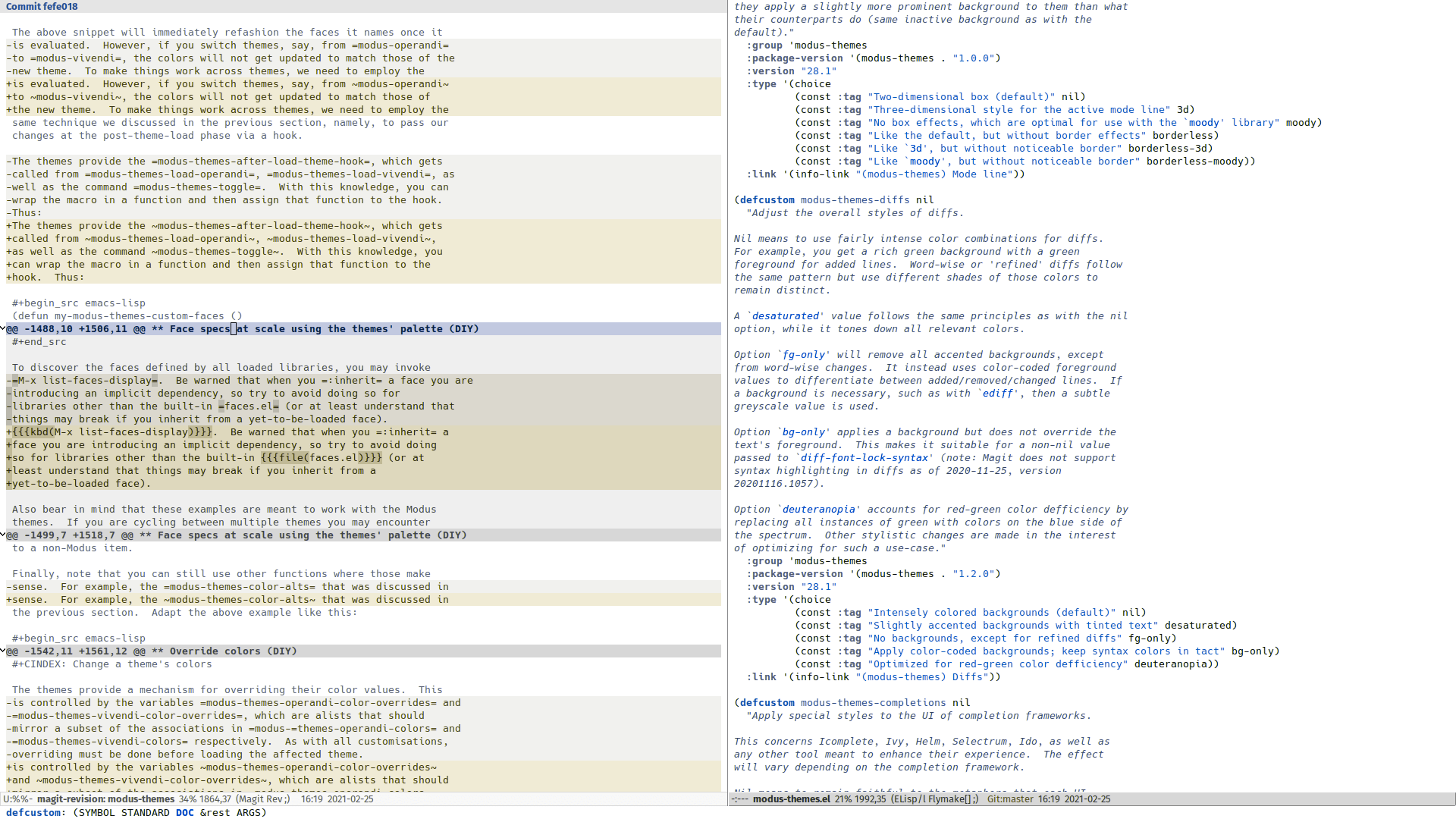
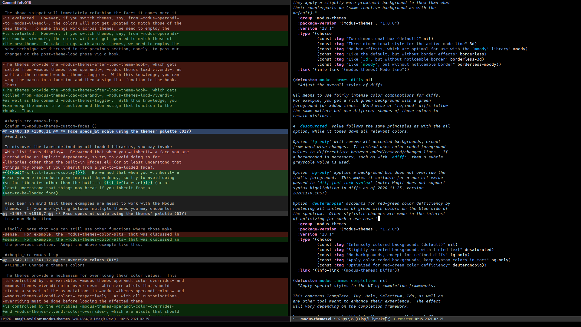
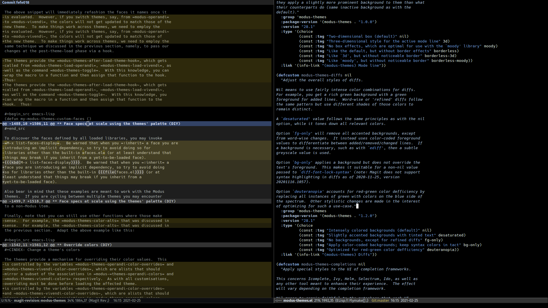
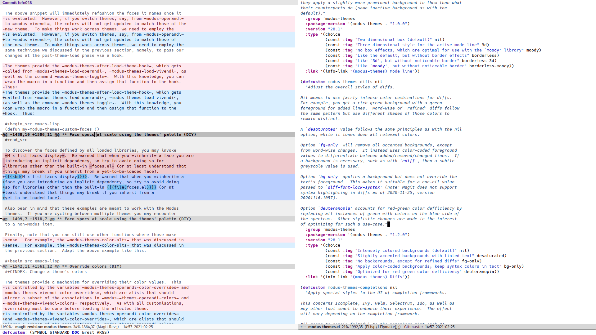
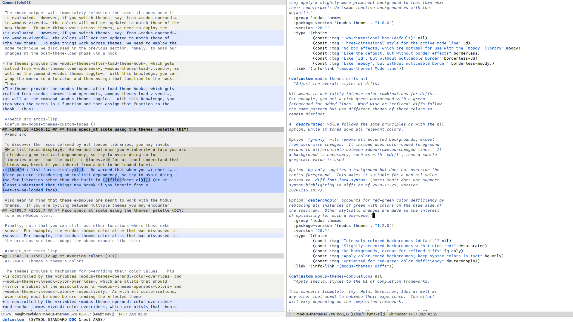
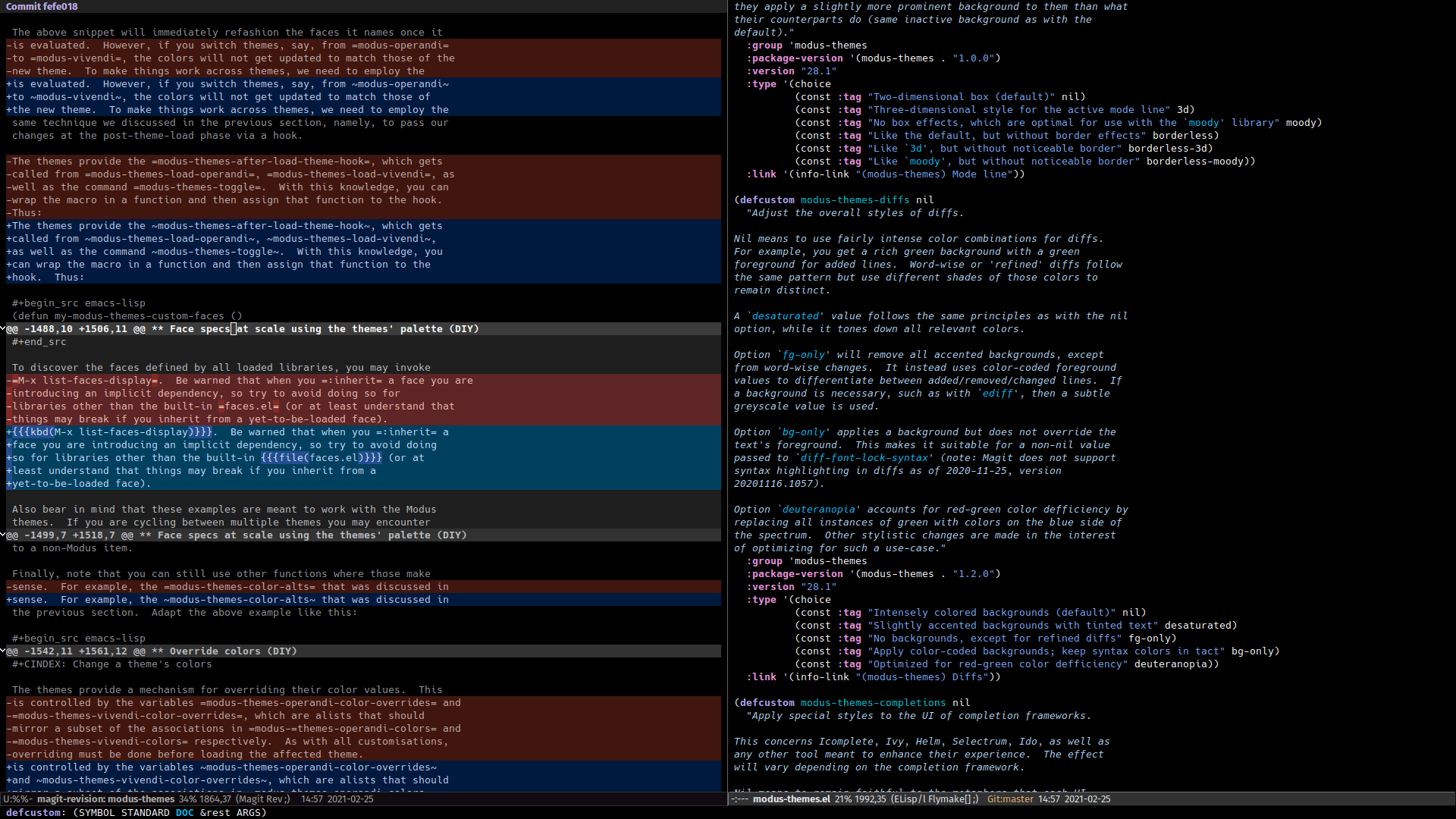
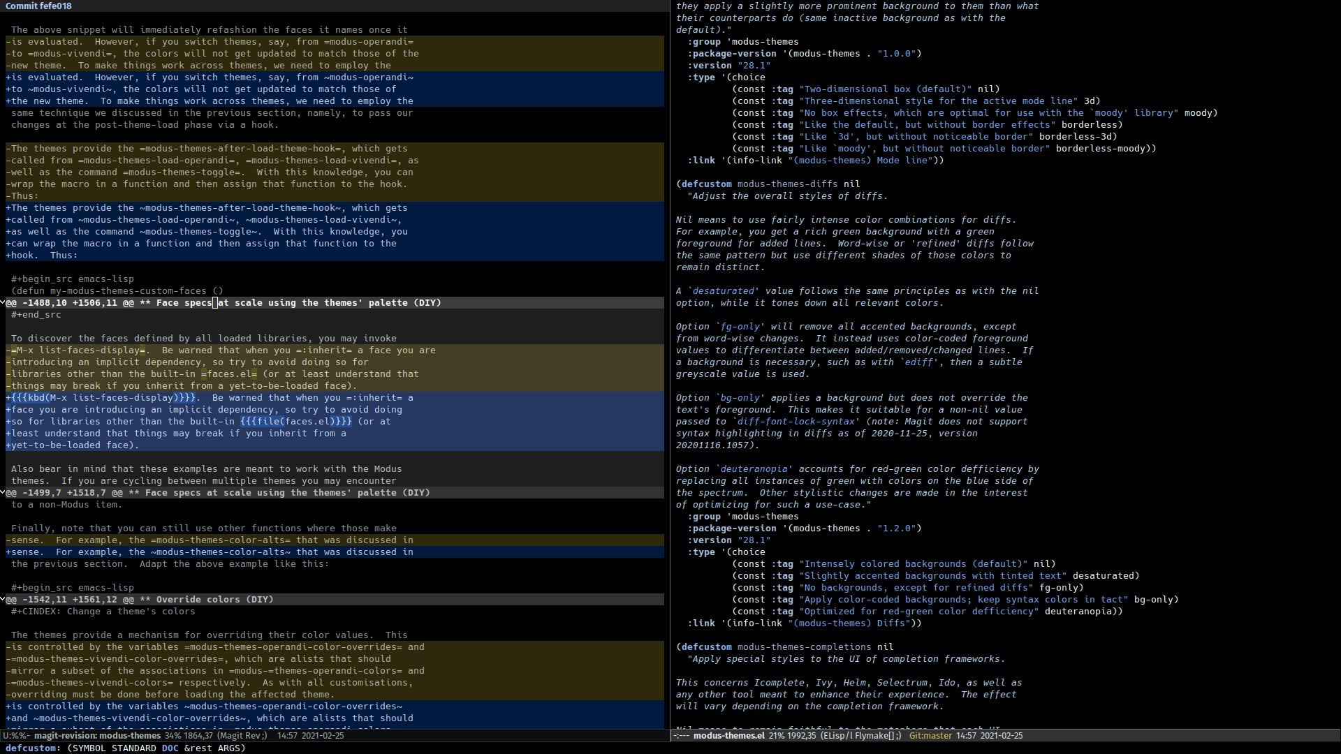
Below are illustrations of the phenomenon while using Magit diffs as an example with word-wise differences enabled (“refined” diffs). We try to simulate how deuteranopia is experienced. Those with it see red and green as variants of brown/yellow and interpret shades of magenta without its red channel’s intensity (magenta consists primarily of red and blue, so it looks closer to a desaturated blue).
Red VS Green (default)
Red VS Blue (‘deuteranopia’ option)
Accessibility broadly understood
While the Modus themes are not designed with the express goal of optimising for deuteranopia across all of Emacs’ interfaces, we can always make steps towards improving that experience. The fact that we already conform with the highest standard for colour contrast (WCAG AAA) puts us in a good position to expand our commitment to accessibility so that it accounts for variations in colour perception.
Designing for such cases is no mean feat. I had to take screenshots of all relevant configurations, display them in the GNU Image Manipulation Program, and set a filter that simulates deuteranopia vision: from GNU IMP’s “View” menu, search for “Display Filters” and then apply “Color Deficient Vision”. That had to be done tens of times during the testing process.
What inspired me to add support for (setq modus-themes-diffs
'deuteranopia) is the blog post of Sam Kleinman (aka “tycho garen”) on
Editor Themes (2021-02-24),
which echoes the relevant wishlist item on my project’s issue tracker
(issue 118)
where I got feedback from Hörmetjan Yiltiz.
Apart from its immediate utility, consider this new feature a statement of intent: I want to make the themes as accessible as possible and am willing to act on user feedback to that end.
If you believe something does not work properly while using either
modus-operandi or modus-vivendi, please do not hesitate to bring the
issue to my attention. Colour is a complex phenomenon: even when we
formally conform with the lofty target of a minimum 7:1 contrast in
relative luminance, we may still encounter cases where things do not
“feel right”. We can always fix those outright or, where necessary,
benefit from the power of Elisp to provide the relevant customisation
options.
