Final thoughts on MOA keycaps and spherical tops in general
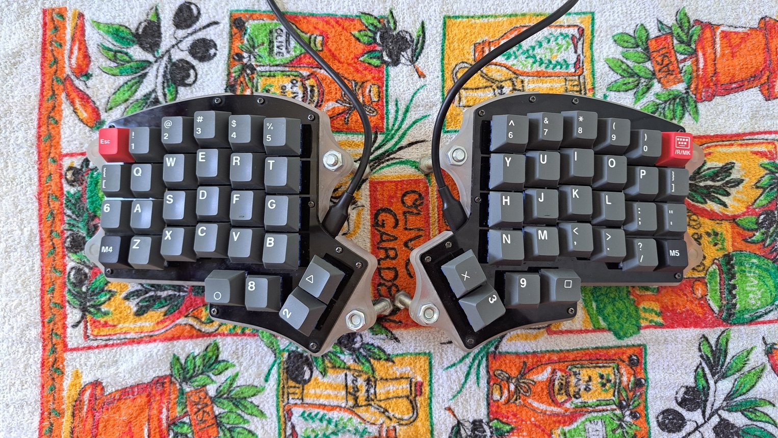
In the previous entry, I shared my first impressions of the cute MOA profile keycaps. MOA is a profile with a uniform height and spherical tops. It also sports a typically playful aesthetic, though I will not cover this point here as I am indifferent to it. After spending some time with this profile on my Iris split ergonomic keyboard (thanks to “Andreas” for it), I have reached the conclusion that MOA is not suitable for me. I have also realised that spherical tops are an inhibiting factor due to my typing technique. I am thus reverting to the Cherry profile set I have (Keychron Dolch Red, gifted by a fellow mechanical keyboard user who prefers to remain anonymous). Here it is:
Uniform height is worse for my typing
One of the potential advantages of uniformly shaped caps is that you can position them anywhere you want on the board. This is especially useful for alternative layouts like Dvorak and Colemak. Sure, there are some kits that include extra keys for those cases, but (i) they add a considerable amount to the total cost of an already expensive set and (ii) the additional caps still are not as flexible in covering any kind of layout. Uniformly shaped caps can be shuffled around at any time, without affecting the typing feel. This is not relevant to me though, as I am using US Qwerty. What I care about is the experience while writing.
For the thumb cluster of the Iris, a uniform height is vastly inferior
to a sculptured one. If you notice in the picture I share above, I use
three different heights for maximum comfort. The two outermost keys
for which the thumb needs to stretch or curl (those with the
PlayStation-style legends) have the tallest height and are oriented to
best meet the thumb from where it accesses them. The corner keys (2
and 3) have the lowest height, which is angled inward to make it
easier to hit the largest possible surface area, be it at the centre
or the edge. Finally, the keys 8 and 9 where my thumbs rest use a
medium height which also has the least amount of angle: the contact is
smooth across the top of the cap. This arrangement is particular to my
hand shape and is further enhanced by the one-shot modifier setup I
maintain (check my QMK configuration
for the technicalities). The gist is that it works brilliantly for me.
With the MOA set I lose these crucial advantages. All keys being the same height means that the thumb must stretch and twist a lot more. The one-shot keys make this less of a problem, though it is an ergonomics penalty regardless. Furthermore, the spherical tops with the pronounced walls on all sides make all keys harder to hit, as the thumb is angled sideways and cannot easily aim for the centre.
As for the alphanumeric keys, I did not notice any improvement going from Cherry to MOA. I did get used to the latter’s uniformity quickly, which suggests that the sculpt is a minor factor here, though I never felt it was better than what I had before. As I am writing this on my Cherry set, I now realise that the numbers are a bit easier to access by stretching my fingers without lifting them as much. This is, in part, due to the varying heights, but also the subtle cylindrical tops. The cylinder shape allows the finger to move freely up and down from the centre of the cap beyond its bounds without encountering any obstacles: this is of paramount importance for my thumbs but it also is nice for the other fingers.
No more spherical tops for me
Compared to the MT3 set I have (I got an Ortho kit at a generous discount and still feel I paid too much), MOA’s tops are less aggressive because they are not very deep and thus have a fairly large surface area. MT3 has those deep, exaggerated dishes that cradle the fingertips if hit at the centre, but otherwise offend them with their acute edges. It is then not just the shape of the tops that matters, but also how deep they are. Between the two styles, MOA is a clear winner in my books. MT3 was uncomfortable even after a few weeks of full-time use.
Still, MOA’s spherical tops have a noticeable wall around them, which
trap the finger and forces it to be raised a lot more than on Cherry
in order to reach another key. In practice, this results in doing
extra work for the same amount of typing. Cherry’s tops are
cylindrical, though only barely so: instead of a wall, there is a
small ramp on the left and right sides. With Cherry, I find that I can
slide the finger sideways without any impediments, such as to go from
j to h. Downward motions, like a to z are equally easy. But
upward motions do require the finger to be lifted. With MOA—or MT3
for that matter—it is not possible to slide around the keyboard at
all.
This granted, MOA’s edges are smooth, which makes off-centre presses
quite forgiving. If there was a variant with a sculptured height, I
would strongly consider it. I hypothesise that the best profile for my
preferences would feature cylindrical tops like Cherry’s (or
marginally flatter), but with a sculpt that allows upward sliding
motions (so the whole profile would look like an open U when seen
from the side). Until I find that, Cherry remains my top pick together
with OEM.
