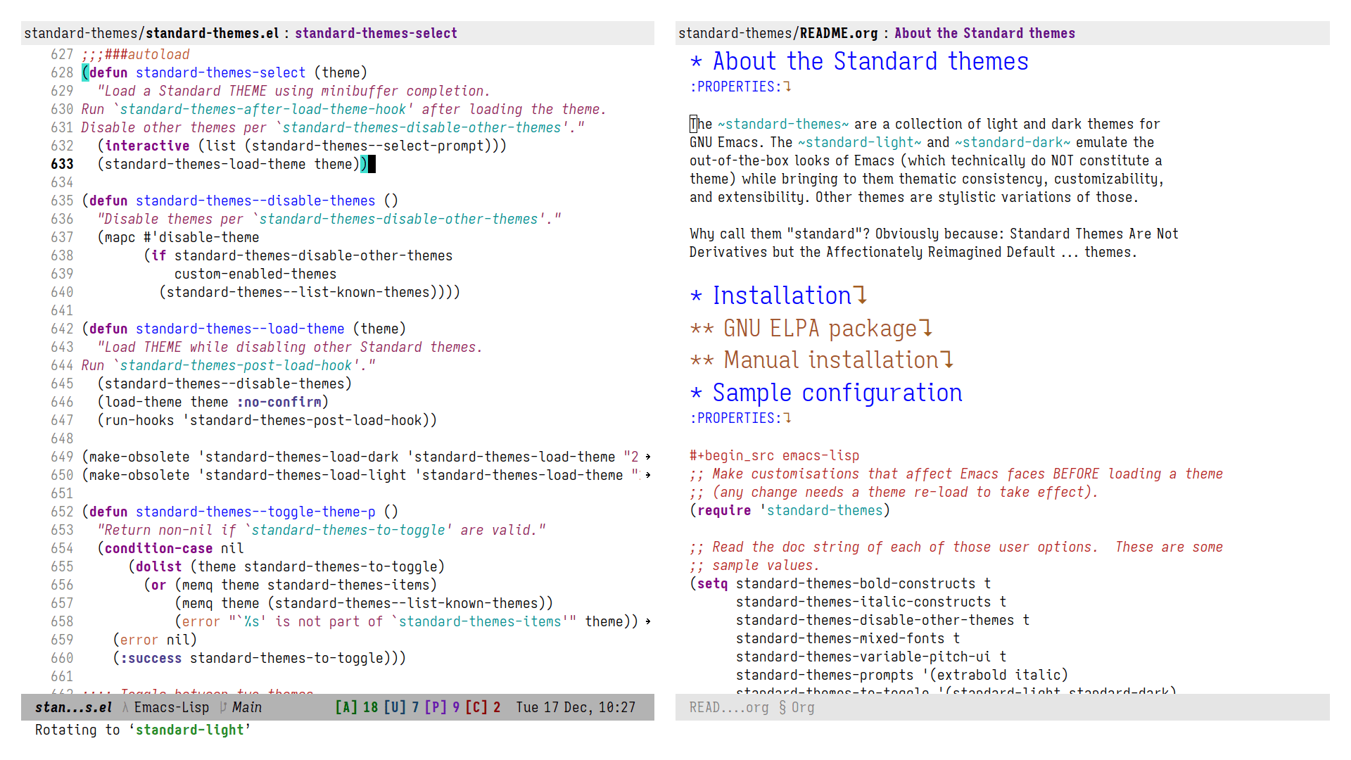
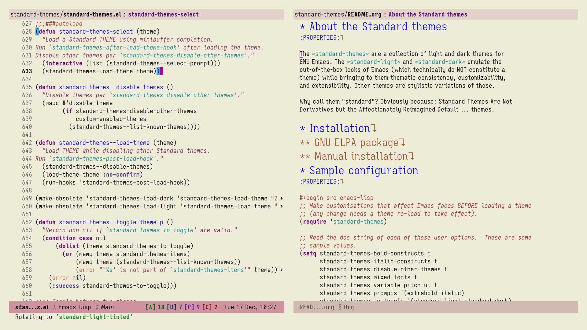
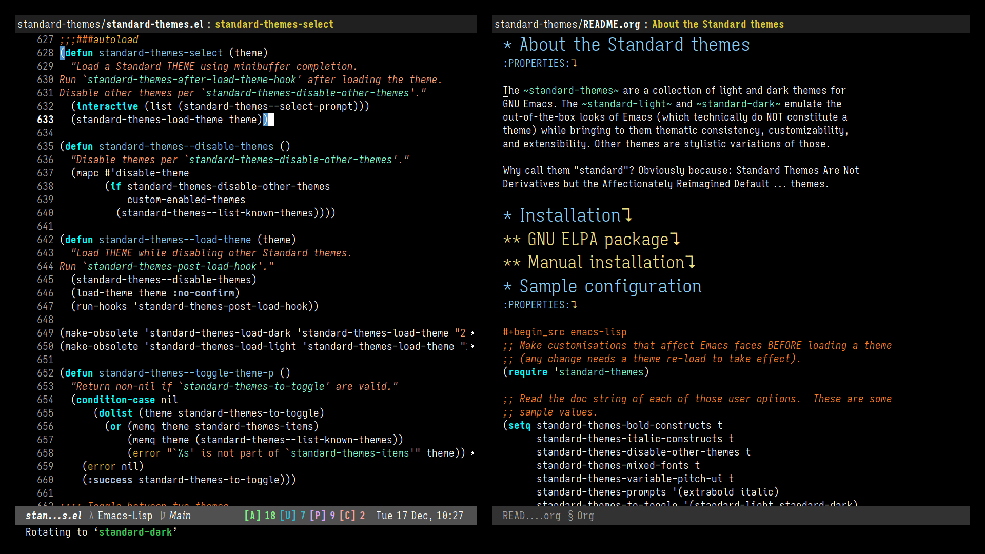
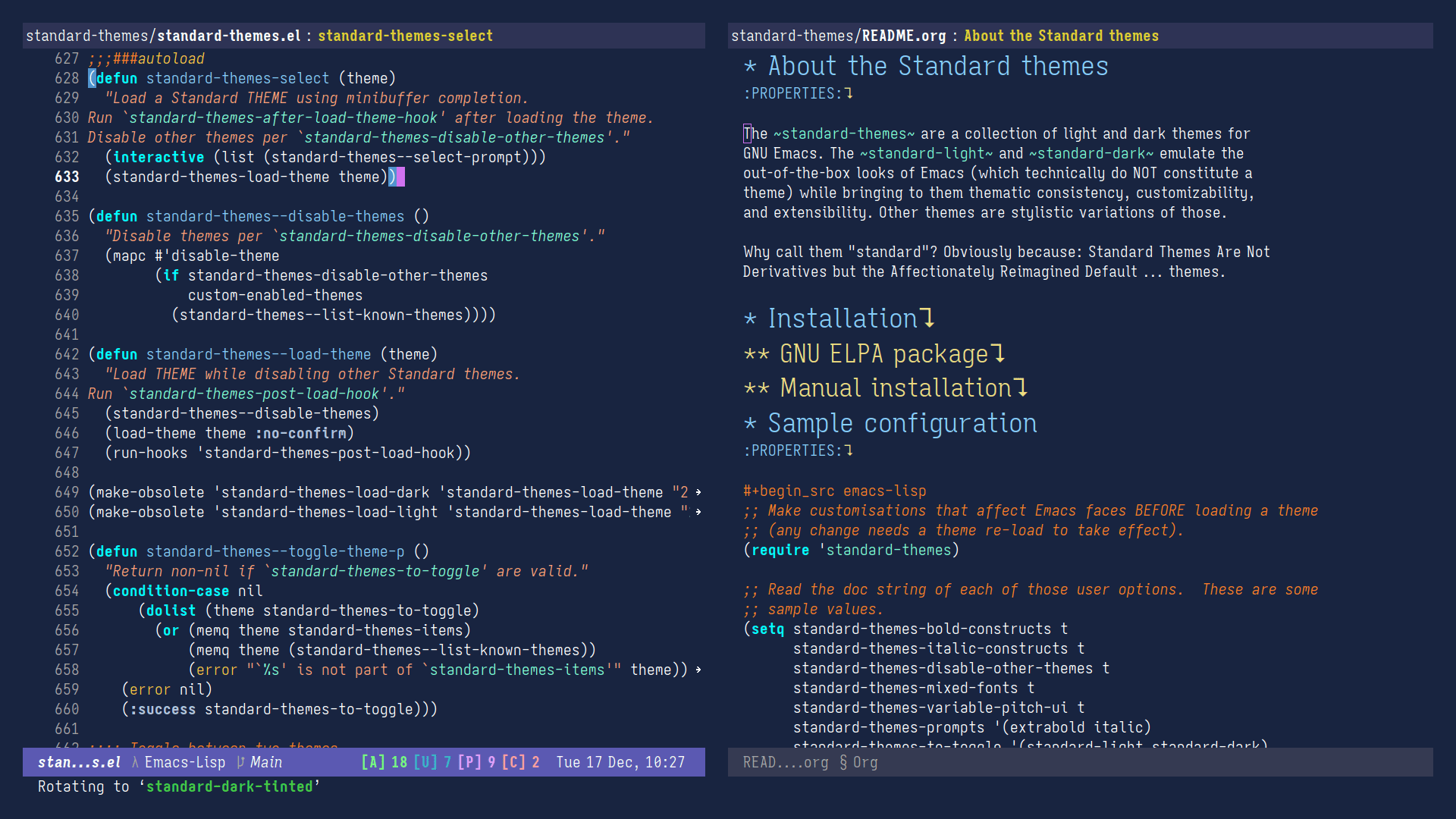
Screen shots of the Standard themes for GNU Emacs
Refer to the official manual for the specifics of the Standard themes. The following screen shots show only the default styles, but note that the themes are highly customisable: we simply cannot produce screenshots for the numerous of stylistic variations.
NOTE: The standard-themes
are designed to be like the out-of-the-box
looks of Emacs. They tweak details, improve upon certain
inconsistencies, cover lots of packages, and provide customisation
options. If you want to see themes that are aligned with my
preferences, check the modus-themes
(built into Emacs) and
ef-themes
.
Default dark style compared to standard-dark
Remember that the standard-themes
are all about details. We do not
deviate from the default aesthetic. This necessarily makes it hard to
demonstrate, although the user will still notice the sum of all those
little refinements once exposed to them.
Dark default VS standard-dark
Org timestamps, TODO, table
The default dark style has too intense timestamps and too subtle
TODO
and DONE
keywords. This is not consistent with its light
counterpart. Furthermore, the default styles add a distinct colour to
timestamps which makes them stand out much more than they need to.
Light default VS standard-light
Org timestamps, TODO, table
Tables in the default light theme are too intense. For long/detailed
entries, this is too burdensome for the eye. standard-light
tones
down this exaggeration in the interest of usability. Timestamps have
a different accent than their default counterparts because they do not
need to stand out as much—they still are easy to spot, but not
over-the-top.
Since we had not showcased the standard-light
theme before, also
notice that the window divider is less intense. This helps the theme
be less distracting. There are many details like that one.