Modus themes: review of the org-habit graph colours
Overview of a tricky exercise in recalibrating colour values for optimal results in their context
UPDATE 2022-01-06 08:09 +0200: I discovered a combination that I had not considered before (light blue next to intense green followed by more light blue), so I tweaked things further. The tables have been updated accordingly.
I spent this afternoon reviewing the subset of the Modus themes’ colour
palette that is used in the org-habit graph. In this post I present
the technicalities of the endeavour. The gist of this publication is
that picking colour values is hard.
Before I delve into the technicalities, I should inform you that I also
took this opportunity to make all the variants of the org-habit graph
work with the modus-themes-deuteranopia toggle, whereas before it only
worked with the traffic-light style (check the doc string of
modus-themes-org-agenda on what those styles are). In short: more
power for users with red-green colour deficiency. Play around with
these:
(setq modus-themes-deuteranopia t) ; try with nil too

(setq modus-themes-org-agenda
      '(;; ...
        ;; Other key . value pairs
        ;; ...
        (habit . nil)))

;; OR

(setq modus-themes-org-agenda
      '(;; ...
        ;; Other key . value pairs
        ;; ...
        (habit . simplified)))

;; OR

(setq modus-themes-org-agenda
      '(;; ...
        ;; Other key . value pairs
        ;; ...
        (habit . traffic-light)))
Now on to the minutia of picking colour values. Since I have started
clocking my time with Org, I am informed that the edits in
modus-themes.el took me 3 hours and 16 minutes. (This does not
include the time required to compile the data and write this entry.)
All those hours to produce this sort of diff:
diff --git a/modus-themes.el b/modus-themes.el
index 7767acf..17f3362 100644
--- a/modus-themes.el
+++ b/modus-themes.el
@@ -495,18 +495,18 @@ (defconst modus-themes-operandi-colors
     ;; those background values should only be used for graphs or similar
     ;; applications where colored blocks are expected to be positioned
     ;; next to each other
-    (red-graph-0-bg . "#ef6f79")
-    (red-graph-1-bg . "#ff9f9f")
-    (green-graph-0-bg . "#49d239")
-    (green-graph-1-bg . "#6dec6d")
-    (yellow-graph-0-bg . "#efec08")
-    (yellow-graph-1-bg . "#dbff4e")
-    (blue-graph-0-bg . "#55a2f0")
-    (blue-graph-1-bg . "#7fcfff")
-    (magenta-graph-0-bg . "#ba86ef")
-    (magenta-graph-1-bg . "#e7afff")
-    (cyan-graph-0-bg . "#30d3f0")
-    (cyan-graph-1-bg . "#6fefff")
+    (red-graph-0-bg . "#ef7969")
+    (red-graph-1-bg . "#ffaab4")
+    (green-graph-0-bg . "#4faa09")
+    (green-graph-1-bg . "#8fef00")
+    (yellow-graph-0-bg . "#ffcf00")
+    (yellow-graph-1-bg . "#f9ff00")
+    (blue-graph-0-bg . "#7090ff")
+    (blue-graph-1-bg . "#9fc6ff")
+    (magenta-graph-0-bg . "#e07fff")
+    (magenta-graph-1-bg . "#fad0ff")
+    (cyan-graph-0-bg . "#70d3f0")
+    (cyan-graph-1-bg . "#afefff")
     ;; the following are for cases where both the foreground and the
     ;; background need to have a similar hue and so must be combined
     ;; with themselves, even though the foregrounds can be paired with
@@ -736,18 +736,18 @@ (defconst modus-themes-vivendi-colors
     ;; those background values should only be used for graphs or similar
     ;; applications where colored blocks are expected to be positioned
     ;; next to each other
-    (red-graph-0-bg . "#af0404")
-    (red-graph-1-bg . "#801f2f")
-    (green-graph-0-bg . "#24ba2f")
-    (green-graph-1-bg . "#0f8f07")
-    (yellow-graph-0-bg . "#ffd03e")
-    (yellow-graph-1-bg . "#d7d800")
-    (blue-graph-1-bg . "#2f50c8")
-    (blue-graph-0-bg . "#5f8fff")
-    (magenta-graph-0-bg . "#af7bee")
-    (magenta-graph-1-bg . "#7f59cf")
-    (cyan-graph-0-bg . "#47dcfa")
-    (cyan-graph-1-bg . "#0bc0df")
+    (red-graph-0-bg . "#bb0404")
+    (red-graph-1-bg . "#6f1f1f")
+    (green-graph-0-bg . "#24ba0f")
+    (green-graph-1-bg . "#1f6f00")
+    (yellow-graph-0-bg . "#f1e00a")
+    (yellow-graph-1-bg . "#b08600")
+    (blue-graph-0-bg . "#2fafef")
+    (blue-graph-1-bg . "#1f2f8f")
+    (magenta-graph-0-bg . "#bf94fe")
+    (magenta-graph-1-bg . "#5f509f")
+    (cyan-graph-0-bg . "#47dfea")
+    (cyan-graph-1-bg . "#00808f")
     ;; the following are for cases where both the foreground and the
     ;; background need to have a similar hue and so must be combined
     ;; with themselves, even though the foregrounds can be paired with
To be clear, these are very subtle differences in some cases. Consider,
for instance a visualisation of one of the tables presented below with
rainbow-mode enabled (check my
dotemacs for relevant configs):
Technical considerations on the usage of those colours
What we are dealing with here are pairs of colour values with a subtle
and an intense variant. Here are screenshots of how the org-habit
graph looks by default (though do check modus-themes-org-agenda).
Modus Operandi (the light theme):
Modus Vivendi (the dark theme):
Unlike most colour combinations where we have a foreground value that is
intended to be used by text and we compare it to a background value to
arrive at a minimum contrast in relative luminance of 7:1 (per the
modus-themes-contrast function), the org-habit colours are all
backgrounds. This means that the 7:1 contrast ratio is not pertinent to
our consideration as we are not testing the legibility of text.
Instead, we have to measure the proximity in colour space of background
values in comparison to each other or, more precisely, in relation to
colours that appear adjacent to them in their particular context
(i.e. we are not particularly interested in all possible combinations).
Furthermore, because of differences in colour perception between light
and dark themes, we must treat modus-operandi and modus-vivendi in their
own right. This is not some simplistic exercise in colour inversion.
To clarify: it is easier to discern colour differences between bright
colours than subdued ones regardless of actual distance in colour space.
The brighter background colours are used with modus-operandi so you will
notice that the distance between them for some of the pairs of red,
green, yellow, blue, magenta, cyan is smaller than in modus-vivendi
(note that we use “magenta” for naming consistency, though sometimes the
actual colour is violet or purple for the purposes of context-dependent
variation).
Unfiltered data of the changes
In the following tables, we show the overall effect of those changes.
The built-in colour-distance function is written as Δ thanks to
(defalias #'Δ #'color-distance). There is no need to focus on the
exact distance value, but mostly on the relative effect. In the next
section we elaborate on the particularities.
[ The formula for those tables which were written in Org notation is
#+TBLFM: $2='(Δ $1 @1$2) :: $3='(Δ $1 @1$3) :: $4='(Δ $1 @1$4) ::
$5='(Δ $1 @1$5) :: $6='(Δ $1 @1$6) :: $7='(Δ $1 @1$7) :: $8='(Δ $1 @1$8)
:: $9='(Δ $1 @1$9) :: $10='(Δ $1 @1$10) :: $11='(Δ $1 @1$11) :: $12='(Δ
$1 @1$12) :: $13='(Δ $1 @1$13)
. ]
OLD Modus Operandi graph (org-habit) colour distance in hueness:
| #ef6f79 | #ff9f9f | #49d239 | #6dec6d | #efec08 | #dbff4e | #55a2f0 | #7fcfff | #ba86ef | #e7afff | #30d3f0 | #6fefff | |
|---|---|---|---|---|---|---|---|---|---|---|---|---|
| #ef6f79 | 0 | 13010 | 121902 | 109012 | 89534 | 88678 | 107221 | 112812 | 40558 | 54313 | 169319 | 152275 |
| #ff9f9f | 13010 | 0 | 123434 | 87960 | 71347 | 54670 | 93134 | 75587 | 30037 | 21759 | 138833 | 103793 |
| #49d239 | 121902 | 123434 | 0 | 13006 | 81037 | 64507 | 100420 | 110104 | 138754 | 165234 | 94658 | 111103 |
| #6dec6d | 109012 | 87960 | 13006 | 0 | 69513 | 35970 | 68764 | 58701 | 98593 | 105128 | 57735 | 55227 |
| #efec08 | 89534 | 71347 | 81037 | 69513 | 0 | 13003 | 213337 | 178080 | 166483 | 142984 | 228952 | 186655 |
| #dbff4e | 88678 | 54670 | 64507 | 35970 | 13003 | 0 | 145428 | 105437 | 119715 | 93081 | 147673 | 106441 |
| #55a2f0 | 107221 | 93134 | 100420 | 68764 | 213337 | 145428 | 0 | 13044 | 29187 | 57497 | 12798 | 26119 |
| #7fcfff | 112812 | 75587 | 110104 | 58701 | 178080 | 105437 | 13044 | 0 | 31268 | 33581 | 15404 | 4764 |
| #ba86ef | 40558 | 30037 | 138754 | 98593 | 166483 | 119715 | 29187 | 31268 | 0 | 13090 | 71096 | 59708 |
| #e7afff | 54313 | 21759 | 165234 | 105128 | 142984 | 93081 | 57497 | 33581 | 13090 | 0 | 91746 | 55269 |
| #30d3f0 | 169319 | 138833 | 94658 | 57735 | 228952 | 147673 | 12798 | 15404 | 71096 | 91746 | 0 | 13017 |
| #6fefff | 152275 | 103793 | 111103 | 55227 | 186655 | 106441 | 26119 | 4764 | 59708 | 55269 | 13017 | 0 |
NEW Modus Operandi graph (org-habit) colour distance in hueness:
| #ef7969 | #ffaab4 | #4faa09 | #8fef00 | #ffcf00 | #f9ff00 | #7090ff | #9fc6ff | #e07fff | #fad0ff | #70d3f0 | #afefff | |
|---|---|---|---|---|---|---|---|---|---|---|---|---|
| #ef7969 | 0 | 21961 | 99439 | 106676 | 53152 | 95386 | 98252 | 92167 | 48246 | 77159 | 118813 | 117359 |
| #ffaab4 | 21961 | 0 | 151991 | 126821 | 70826 | 94926 | 71701 | 41681 | 21983 | 17290 | 71098 | 49758 |
| #4faa09 | 99439 | 151991 | 0 | 29455 | 88591 | 106302 | 165458 | 173577 | 209155 | 227396 | 150578 | 194988 |
| #8fef00 | 106676 | 126821 | 29455 | 0 | 39278 | 32383 | 202638 | 165240 | 217995 | 181945 | 150709 | 158446 |
| #ffcf00 | 53152 | 70826 | 88591 | 39278 | 0 | 9396 | 221491 | 169846 | 163698 | 131790 | 188491 | 163814 |
| #f9ff00 | 95386 | 94926 | 106302 | 32383 | 9396 | 0 | 251105 | 180129 | 203715 | 141390 | 192087 | 158776 |
| #7090ff | 98252 | 71701 | 165458 | 202638 | 221491 | 251105 | 0 | 17390 | 34778 | 68521 | 18677 | 46633 |
| #9fc6ff | 92167 | 41681 | 173577 | 165240 | 169846 | 180129 | 17390 | 0 | 32035 | 23787 | 6876 | 7461 |
| #e07fff | 48246 | 21983 | 209155 | 217995 | 163698 | 203715 | 34778 | 32035 | 0 | 28445 | 62589 | 57301 |
| #fad0ff | 77159 | 17290 | 227396 | 181945 | 131790 | 141390 | 68521 | 23787 | 28445 | 0 | 52564 | 19936 |
| #70d3f0 | 118813 | 71098 | 150578 | 150709 | 188491 | 192087 | 18677 | 6876 | 62589 | 52564 | 0 | 13964 |
| #afefff | 117359 | 49758 | 194988 | 158446 | 163814 | 158776 | 46633 | 7461 | 57301 | 19936 | 13964 | 0 |
OLD Modus Vivendi graph (org-habit) colour distance in hueness:
| #af0404 | #801f2f | #24ba2f | #0f8f07 | #ffd03e | #d7d800 | #5f8fff | #2f50c8 | #af7bee | #7f59cf | #47dcfa | #0bc0df | |
|---|---|---|---|---|---|---|---|---|---|---|---|---|
| #af0404 | 0 | 13197 | 185352 | 139125 | 193417 | 185677 | 251071 | 162793 | 184769 | 135146 | 368694 | 333961 |
| #801f2f | 13197 | 0 | 116655 | 84300 | 171524 | 163539 | 164986 | 87854 | 128352 | 78064 | 260218 | 220994 |
| #24ba2f | 185352 | 116655 | 0 | 13063 | 126754 | 89687 | 134979 | 112496 | 158089 | 126444 | 123269 | 92241 |
| #0f8f07 | 139125 | 84300 | 13063 | 0 | 171398 | 120415 | 186877 | 126247 | 204125 | 150274 | 199253 | 148378 |
| #ffd03e | 193417 | 171524 | 126754 | 171398 | 0 | 13021 | 173197 | 225287 | 114798 | 150176 | 174725 | 217076 |
| #d7d800 | 185677 | 163539 | 89687 | 120415 | 13021 | 0 | 216096 | 246294 | 166931 | 186457 | 207224 | 232936 |
| #5f8fff | 251071 | 164986 | 134979 | 186877 | 173197 | 216096 | 0 | 29588 | 18647 | 20223 | 25318 | 28261 |
| #2f50c8 | 162793 | 87854 | 112496 | 126247 | 225287 | 246294 | 29588 | 0 | 51398 | 15558 | 87284 | 54868 |
| #af7bee | 184769 | 128352 | 158089 | 204125 | 114798 | 166931 | 18647 | 51398 | 0 | 13011 | 65355 | 83889 |
| #7f59cf | 135146 | 78064 | 126444 | 150274 | 150176 | 186457 | 20223 | 15558 | 13011 | 0 | 81596 | 74264 |
| #47dcfa | 368694 | 260218 | 123269 | 199253 | 174725 | 207224 | 25318 | 87284 | 65355 | 81596 | 0 | 13086 |
| #0bc0df | 333961 | 220994 | 92241 | 148378 | 217076 | 232936 | 28261 | 54868 | 83889 | 74264 | 13086 | 0 |
NEW Modus Vivendi graph (org-habit) colour distance in hueness:
| #b52c2c | #702020 | #4fd100 | #007800 | #f1e00a | #b08600 | #2fafef | #1f2f8f | #bf94fe | #5f509f | #47dfea | #00808f | |
|---|---|---|---|---|---|---|---|---|---|---|---|---|
| #b52c2c | 0 | 13285 | 140927 | 106198 | 143404 | 37209 | 211299 | 80341 | 144794 | 56938 | 250752 | 132324 |
| #702020 | 13285 | 0 | 131612 | 62148 | 194886 | 55042 | 208369 | 49756 | 190061 | 52156 | 259676 | 99738 |
| #4fd100 | 140927 | 131612 | 0 | 45485 | 70640 | 46382 | 165460 | 168324 | 207617 | 135432 | 150260 | 98638 |
| #007800 | 106198 | 62148 | 45485 | 0 | 188588 | 74000 | 184251 | 84053 | 261174 | 98026 | 211507 | 62084 |
| #f1e00a | 143404 | 194886 | 70640 | 188588 | 0 | 44871 | 235668 | 282865 | 159638 | 193095 | 196844 | 226941 |
| #b08600 | 37209 | 55042 | 46382 | 74000 | 44871 | 0 | 195184 | 134954 | 149680 | 91391 | 198362 | 128070 |
| #2fafef | 211299 | 208369 | 165460 | 184251 | 235668 | 195184 | 0 | 93048 | 55062 | 59227 | 10653 | 40571 |
| #1f2f8f | 80341 | 49756 | 168324 | 84053 | 282865 | 134954 | 93048 | 0 | 135801 | 14376 | 151789 | 28445 |
| #bf94fe | 144794 | 190061 | 207617 | 261174 | 159638 | 149680 | 55062 | 135801 | 0 | 64611 | 60159 | 121516 |
| #5f509f | 56938 | 52156 | 135432 | 98026 | 193095 | 91391 | 59227 | 14376 | 64611 | 0 | 98948 | 29899 |
| #47dfea | 250752 | 259676 | 150260 | 211507 | 196844 | 198362 | 10653 | 151789 | 60159 | 98948 | 0 | 71126 |
| #00808f | 132324 | 99738 | 98638 | 62084 | 226941 | 128070 | 40571 | 28445 | 121516 | 29899 | 71126 | 0 |
Particular requirements for each theme
For modus-operandi the intent was two-fold: (i) to reduce the overall
intensity of most values without undermining their utility and (ii) to
fine-tune specific colour combinations. Here is a comparison of old and
new value pairs.
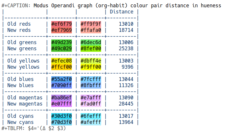
Modus Operandi graph (org-habit) colour pair distance in hueness:
| Distance | |||
|---|---|---|---|
| Old reds | #ef6f79 | #ff9f9f | 13010 |
| New reds | #ef7969 | #ffaab4 | 21961 |
| Old greens | #49d239 | #6dec6d | 13006 |
| New greens | #4faa09 | #8fef00 | 29455 |
| Old yellows | #efec08 | #dbff4e | 13003 |
| New yellows | #ffcf00 | #f9ff00 | 9396 |
| Old blues | #55a2f0 | #7fcfff | 13044 |
| New blues | #7090ff | #9fc6ff | 17390 |
| Old magentas | #ba86ef | #e7afff | 13090 |
| New magentas | #e07fff | #fad0ff | 28445 |
| Old cyans | #30d3f0 | #6fefff | 13017 |
| New cyans | #70d3f0 | #afefff | 13964 |
Notice that the yellow pair have been brought closer, despite the general trend to amplify the distinction between the values in each pair (well “amplify” may give the wrong impression as these are subtle tweaks—check again the first screenshot). This reduction may seem like an error, though it is part of the design (and why we must look at things holistically without following every rule to the letter while remaining oblivious to its spirit). Consider that the old subtle yellow (#dbff4e) was too close to the subtle red (#ff9f9f). Same for the subtle yellow next to the intense red. Those combinations appear next to each other and thus need to be accounted for. The compromise we had to make was to marginally reduce the distance betweent the new subtle red (#ffaab4) and the new intense yellow (#ffcf00). The following table illustrates this point:
Modus Operandi select graph (org-habit) colour pairs distance in hueness:
| Distance | |||
|---|---|---|---|
| Old subtle yellow vs subtle red | #dbff4e | #ff9f9f | 54670 |
| New subtle yellow vs subtle red | #f9ff00 | #ffaab4 | 94926 |
| Old subtle yellow vs intense red | #dbff4e | #ef6f79 | 88678 |
| New subtle yellow vs intense red | #f9ff00 | #ef7969 | 95386 |
| Old subtle red vs intense yellow | #ff9f9f | #efec08 | 71347 |
| New subtle red vs intense yellow | #ffaab4 | #ffcf00 | 70826 |
The new colours work better in general, but let us not belabour the point.
For modus-vivendi the task was somewhat more straightforward as all we
had to do was to tone down the colours while paying attention to
inter-pair relations. This is paradoxically more tricky to convey with
raw data as one has to compare the visuals of the before and after
states (it is easier to discern colours on a dark backdrop because
“colour” is an expression of light). Suffice to say that we have
eliminated any exaggerations without making compromises on the relevant
functionality. Still, we managed to amplify the colour distance almost
across the board while avoiding any overshoot in intensity. This table
compares each pair of intense and subtle hues:
Modus Vivendi graph (org-habit) colour pair distance in hueness:
| Distance | |||
|---|---|---|---|
| Old reds | #af0404 | #801f2f | 13197 |
| New reds | #b52c2c | #702020 | 13285 |
| Old greens | #24ba2f | #0f8f07 | 13063 |
| New greens | #24bf00 | #007800 | 23026 |
| Old yellows | #ffd03e | #d7d800 | 13021 |
| New yellows | #f7ef00 | #b08600 | 58819 |
| Old blues | #5f8fff | #2f50c8 | 29588 |
| New blues | #2fafef | #1f2f8f | 93048 |
| Old magentas | #af7bee | #7f59cf | 13011 |
| New magentas | #bf94fe | #5f509f | 64611 |
| Old cyans | #47dcfa | #0bc0df | 13086 |
| New cyans | #47dfea | #00808f | 71126 |
Now here comes the counter-intuitive part. For modus-operandi the
yellow+red combinations had to be rendered more clear. Whereas for
modus-vivendi we had to bring colours closer to each other to avoid
exaggerations in intensity. Remember that modus-vivendi has a black
background, so any extra intensity is immediately noticeable.
Modus Vivendi select graph (org-habit) colour pairs distance in hueness:
| Distance | |||
|---|---|---|---|
| Old subtle yellow vs subtle red | #d7d800 | #801f2f | 163539 |
| New subtle yellow vs subtle red | #b08600 | #702020 | 55042 |
| Old subtle green vs subtle blue | #0f8f07 | #2f50c8 | 126247 |
| New subtle green vs subtle blue | #007800 | #1f2f8f | 84053 |
Tricky though perhaps dull
I understand this is not an interesting topic and it probably is too difficult to relate to the various data points without visualising them and comparing the before and after states. Furthermore, data can be deceptive and I have always maintained that theme development stands at the intersection of science and art (at least for the purposes of conforming with the rigorous accessibility standards of the Modus themes).
That granted, I wanted to shed light on the “behind the scenes” work
that is not immediately obvious when one checks a diff that introduces
some seemingly trivial tweaks like #49d239 -> #49c029 or #7fcfff
-> #8fbfff.