Modus themes: review rainbow-delimiters faces
The present report documents the otherwise subtle changes to the styling
of the rainbow-delimiters faces. I received user feedback from
Christopher Dimech, to whom I am most thankful. What we have tried to
achieve is two-fold (any errors are my own):
- Broaden the selection of colours, without prejudice to the overarching accessibility standard of the themes (quantified as a contrast in relative luminance of 7:1 between any given combination of background and foreground—the WCAG AAA standard).
- Control the colour distance between adjacent values, as those apply to each level of delimiter depth.
Those combined enhance the “rainbow” quality of the aforementioned library and, thus, make the support for it at the theme level better overall.
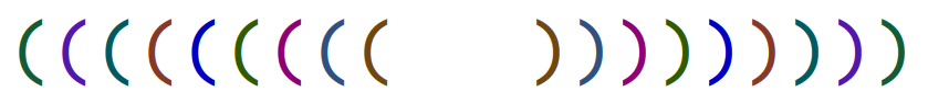
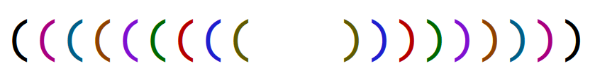
Before and after
Here are some close-up screenshots comparing the levels of delimiter depth between old and new styles. Notice how the first level of the new ones is the same as the main foreground (black/white). This little touch ensures that you do not get colouration with no semantic value for balanced expressions that are only one level deep.
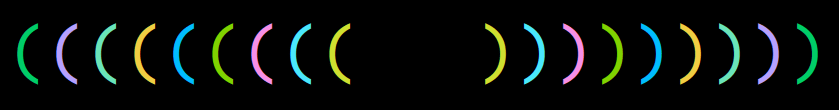
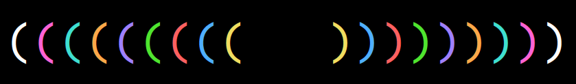
Contexualised effect
Using those same styles, here is some code. Open the images to see them at full scale. Also remember that bold and slanted constructs are optional, as well as several other parameters—consult the Modus themes manual).

Colour distance between the old colours
The following tables, written in org-mode notation, calculate the
colour distance between adjacent delimiter foregrounds while accounting
for their positional placement (so 1 compared with 2, 2 with 3, and so
on):
#+DESCRIPTION: Colour distance between foregrounds (Modus Operandi old)
| 1       | 2       | Distance |
|---------+---------+----------|
| #145c33 | #5317ac |    69287 |
| #5317ac | #005a5f |    50065 |
| #005a5f | #863927 |    53989 |
| #863927 | #0000c0 |   118623 |
| #0000c0 | #315b00 |   146343 |
| #315b00 | #8f0075 |    90740 |
| #8f0075 | #30517f |    48311 |
| #30517f | #70480f |    43837 |
#+TBLFM: $3='(color-distance $1 $2)

#+DESCRIPTION: Colour distance between foregrounds (Modus Vivendi old)
| 1       | 2       | Distance |
|---------+---------+----------|
| #00cd68 | #b6a0ff |   147580 |
| #b6a0ff | #6ae4b9 |    45596 |
| #6ae4b9 | #f0ce43 |    82999 |
| #f0ce43 | #00bcff |   234824 |
| #00bcff | #80d200 |   219273 |
| #80d200 | #f78fe7 |   178927 |
| #f78fe7 | #4ae8fc |   112296 |
| #4ae8fc | #cfdf30 |   148519 |
#+TBLFM: $3='(color-distance $1 $2)
You can see in the third column that the colour distance is inconsistent, with some combinations being better than others. Our intent here is to normalise the distance between each pair so that the results are more uniform.
Colour distance between the new colours
Same principle as above, only now we are applying new colours in a different sequence that is conducive to our ends. You can now tell that the third column shows a greater level of consistency, understood as a harmonised distance in colour space between each pair.
#+DESCRIPTION: Colour distance between foregrounds (Modus Operandi new)
| 1       | 2       | Distance |
|---------+---------+----------|
| #000000 | #a8007f |   109670 |
| #a8007f | #005f88 |   102860 |
| #005f88 | #904200 |   101746 |
| #904200 | #7f10d0 |   118454 |
| #7f10d0 | #006800 |   187726 |
| #006800 | #b60000 |   122282 |
| #b60000 | #1f1fce |   169872 |
| #1f1fce | #605b00 |   141743 |
#+TBLFM: $3='(color-distance $1 $2)

#+DESCRIPTION: Colour distance between foregrounds (Modus Vivendi new)
| 1       | 2       | Distance |
|---------+---------+----------|
| #ffffff | #ff62d4 |   103094 |
| #ff62d4 | #3fdfd0 |   160498 |
| #3fdfd0 | #fba849 |   149161 |
| #fba849 | #9f80ff |   103680 |
| #9f80ff | #4fe42f |   166683 |
| #4fe42f | #fe6060 |   157802 |
| #fe6060 | #4fafff |   166841 |
| #4fafff | #f0dd60 |   137617 |
#+TBLFM: $3='(color-distance $1 $2)
The exact same distance is not always possible, because each colour value must also conform with our accessibility target when compared to its background. What we do here is an approximation or else an attempt to optimise the use of resources within an overarching constraint (a good one, but a constraint nonetheless).
Ongoing refinements
Note that it is always easier to work with colours against a dark
backdrop. Colour is luminant and darkness is interpreted as the absence
of luminance, so nuances are easier to spot. This, in turn, means that
the potential for errors is greater, even after having narrowed the
colour space to only the values that pass the accessibility criterion of
the themes (the 7:1 contrast—also check the modus-themes-contrast
function that is documented in the manual).
Technicalities aside, this review constitutes another step towards
delivering a comprehensive package for styling GNU Emacs in accordance
with the highest legibility standard. It comes just a few days after
the overhaul of the org-habit faces (no report for that as I had other
things to write, but you can read the minutia in issue
135—thanks
again to Gustavo Barros for the feedback there).
With the major release of version 1.0.0 earlier this month, we are in
the process of iterating on what already is a solid basis. Propitious
growth, one might say.
If you use the themes and feel that something does not work well enough, please contact me. I am always eager to review things and learn from your insights.